Chambers Fine Art is pleased to announce the opening of Ho Sintung: Surfaced on February 2nd, 2017. Born in Hong Kong in 1986, Ho Sintung graduated from the Department of Fine Arts of the Chinese University of Hong Kong in 2008 and currently lives and works in Hong Kong. This will be her first exhibition in New York.
Preferring to work on a small scale and favoring pencil and graphite on paper above other media, she gives visual expression to her intentional misreading of all aspects of the cinema, not only films themselves but the buildings in which they are shown, posters and other ephemera. Drawing from her interest in films and literature, her work also reveals her familiarity with a wide range of twentieth century visual art to which she refers in her tongue-in-cheek hommages to the “movies.” The title she has chosen for this exhibition Surfaced is taken from a short story – a dark tale that is fittingly related to drawing – part of Strange Stories from a Chinese Studio by the Qing dynasty author Pu Songling.
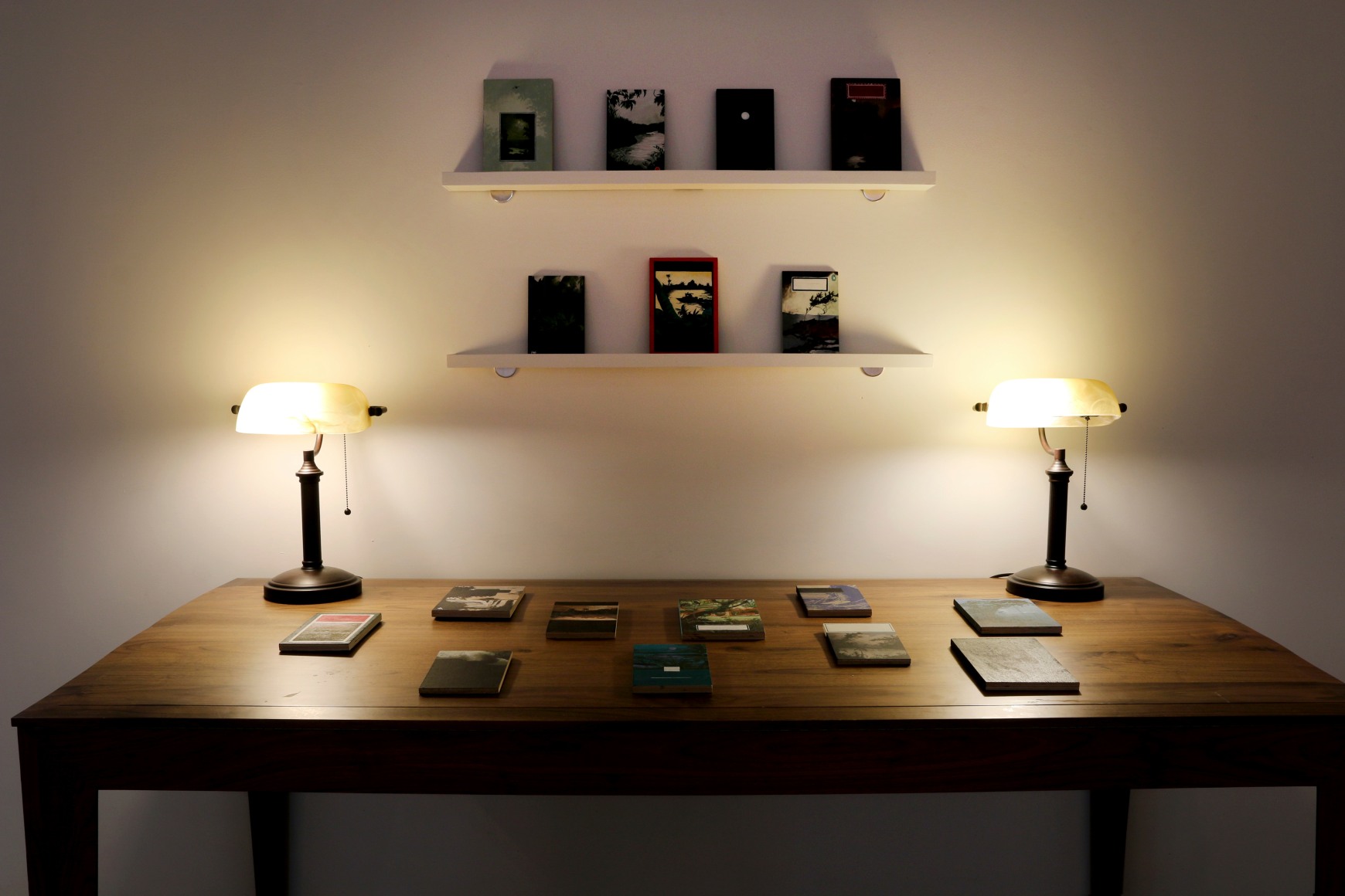
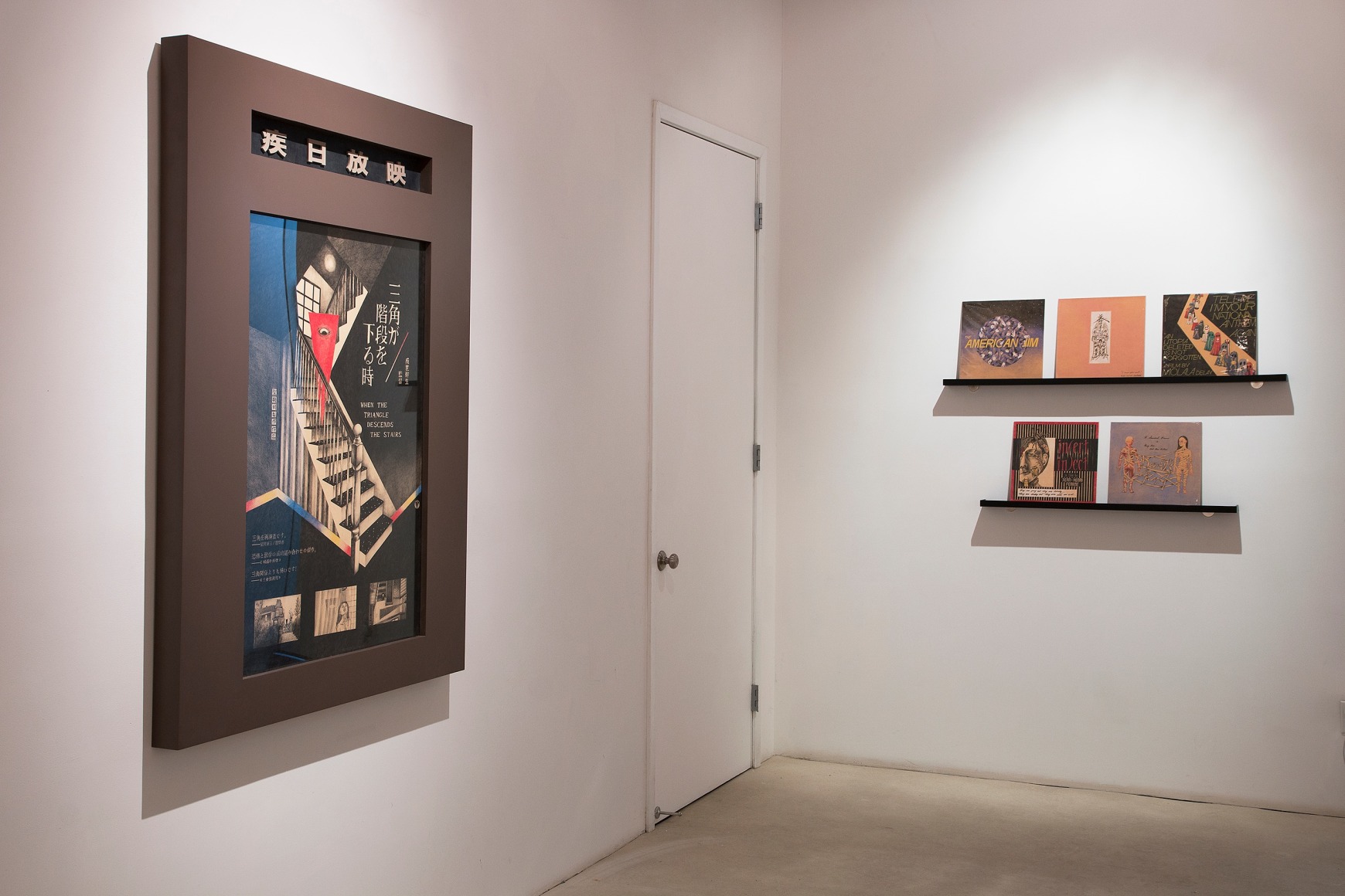
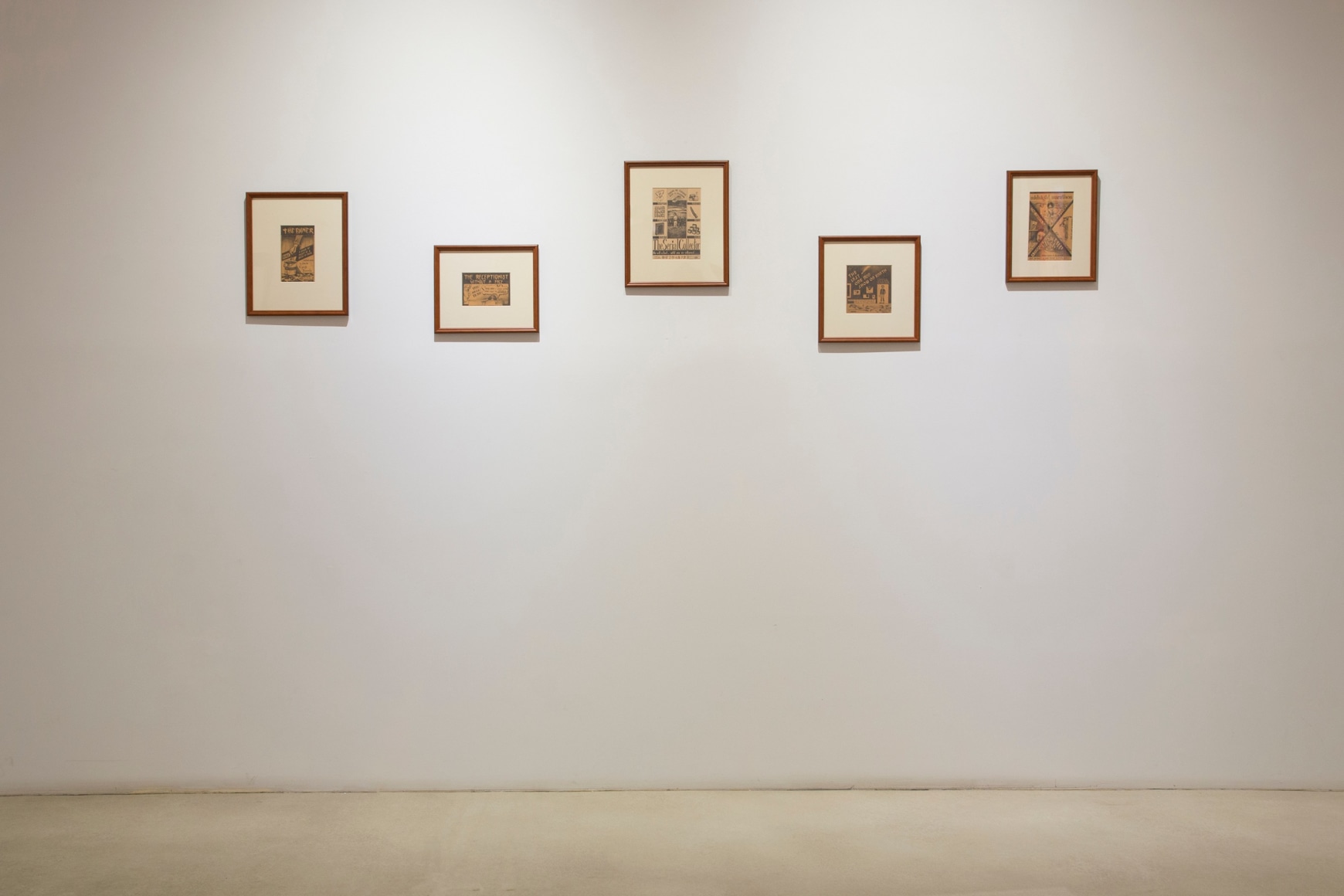
In Surfaced the focus on horror movies is supplemented by designs for vintage LP covers and newspaper ads for imaginary movies. She recognizes that “the horror film has a significance in the history of film that should not be neglected – it tirelessly brings up the past, retelling stories that have been rejected over and over again. It makes sure that prayers that were unheard will be heard; justice that was absent will resurface once more. Horror films respond to reality in the same way that our bodies react to horror films. These drawings, although milder and more tactful in tone, disrupt the familiarity of the densely-knit fabric of day-to-day life, exposing its inner abnormality.” Sintung’s Heart(s) of Darkness(es) brings a touch of the real world to the exhibition, where she re-creates 17 existing editions of Joseph Conrad’s Heart of Darkness: “The heart is such an abstract idea, yet different designers across the world attempted to capture its essence with landscapes. By re-painting these covers, I create my own collection of haunted landscapes.”
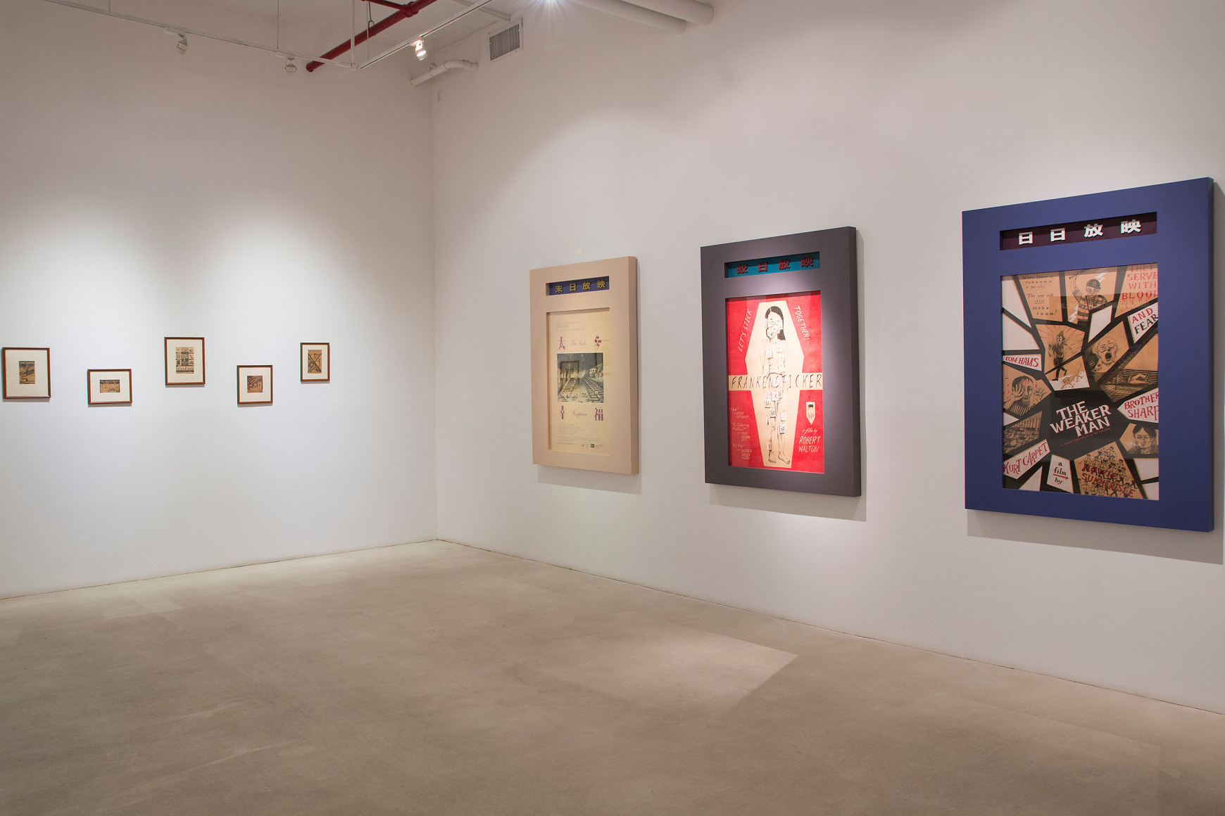
Her fastidiously executed posters for imaginary horror films with their off-beat humor and eccentric typography captivate with their mordant wit. Who would not want to sneak into a darkened theater to see The Weaker Man: A Zombie Apocalypse of the Homeless, in which zombie police only attack the homeless or Frankensticker, a tantalizing variation on perhaps the most famous horror story of all time? Equally enticing is When the Triangle Descends the Stairs, a rare abstract incursion into the realm of the horrific. In a number of cases film stills give a foretaste of the horrors awaiting viewers of the movies as, for example, in Outlive the Light in which the temperature rises from 37 to 124 degrees in five days.
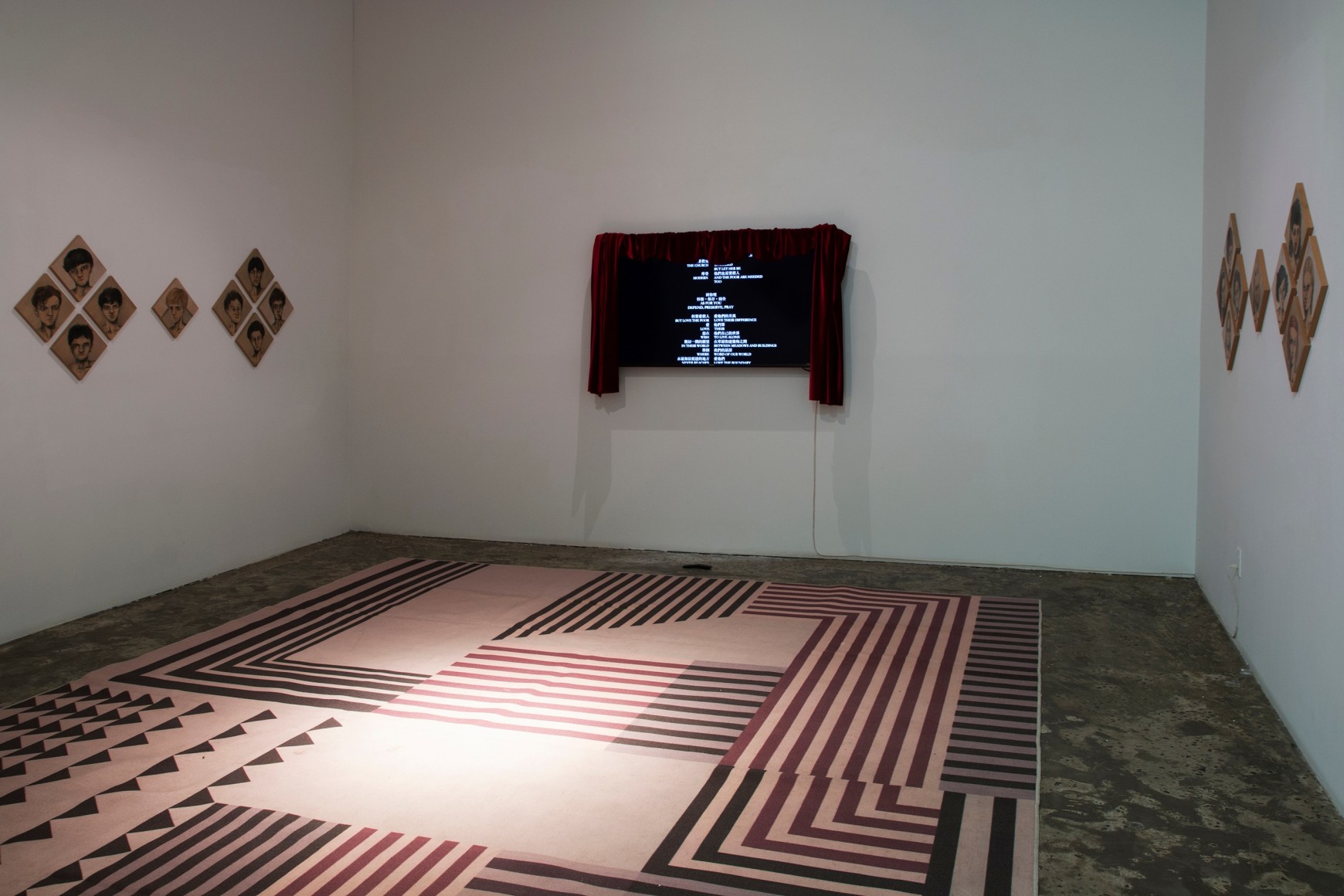
In the small gallery Ho Sintung pays homage to one of the twentieth century’s most notorious cinematic masterpieces, Pier Paolo Pasolini’s Salo, or the 120 Days of Sodom which was inspired by the magnum opus of the Marquis de Sade. Obsessed by the design of the carpet with a geometric design reflecting the aesthetics of the fascists that became the stage for torture scenes, Ho Sintung replicates it in Last Party as portraits of the actors and actresses establish a dialog with the viewer and Pasolini’s poem “Goodbye and best wishes” scrolls down the wall in lieu of film credits.
The particular charm of Ho Sintung’s posters for non-existent films and installations derives from her ability to compress a wide range of cinematic, art historical and literary references into carefully orchestrated compositions. Executed with the greatest finesse in colored pencil on tea-stained paper they exude what the artist refers to as “an antiquated quality.” Unique among cinéastes, she gives visual expression to her ‘mis-reading’ of all aspects of the cinema rather than formal and critical analysis.

